
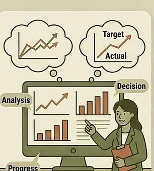
Graphs are one of the most powerful tools for both clinical decision-making and family communication, because they make a trend visible at a glance in a way that a table of numbers or a page of notes often cannot.
The most common and useful format for tracking behavioral or skill data over time is a simple line graph, with time (sessions or dates) on the horizontal axis and the measured value (frequency, duration, percentage correct, etc.) on the vertical axis (PowerBack Pediatrics, "A Parent's Guide To Understanding ABA Progress Graphs"). When interpreting such a graph clinically, look for the overall slope and direction (is the line trending up, down, or flat over a meaningful number of data points), the level (where the data points generally sit -- is a "reduced" target behavior still occurring at a clinically significant rate, or has it dropped to a manageable level), the variability (how much the data bounces around from session to session -- high variability can make a trend harder to interpret confidently and may itself be worth investigating), and any clear change points (does the trend shift noticeably around the time a new strategy was introduced, which supports, though does not alone prove, that the strategy is responsible).
A specific technique worth knowing: converting raw counts into percentages or rates often makes data more interpretable and comparable across sessions of different lengths. For example, "responded correctly 5 out of 10 times" (50%) is more comparable across sessions than a raw count of "5 correct responses," especially if session length or number of opportunities varies from day to day.
Context always matters when interpreting a data point, not just the number itself. As one pediatric resource notes in the context of explaining data to parents, the same raw behavior can mean very different things depending on context -- for example, a child throwing a ball during active play is a very different data point from a child throwing an object during a frustration episode, even though both might be logged under a similar behavior category if the observer isn't careful to capture context alongside the count (PowerBack Pediatrics, "A Parent's Guide To Understanding ABA Progress Graphs").
Practical takeaway: When reviewing any progress graph, look at the overall trend across many points rather than reacting to the most recent single point, and always keep the underlying context of each data point available (not just the number), since two identical-looking data points can mean very different things.
This guide is general information, not a diagnosis or medical advice. If you're worried about your child, the next step is a conversation with a qualified therapist.
Keep reading
More for your practice
Structured courses with completion tracking live in your therapist dashboard.